
Matplotlib

Matplotlib is a Python library for creating graphs and data visualizations. It is a fundamental tool for data analysis and presenting results. This document shows practical examples of using Matplotlib to create different types of charts. You can take it as a set of recipes for your own visualizations. You can explore more in the official Matplotlib documentation.
Installation
To install Matplotlib, use pip:
python3 -m pip install matplotlibTo have headers for type checking, you can also install the matplotlib-stubs package (still somewhat imperfect):
python3 -m pip install matplotlib matplotlib-stubsFirst plot
The most used module of Matplotlib is pyplot. This example shows how to create a basic line plot with axis labels and a title:
import matplotlib.pyplot as plt

x = [1, 2, 3, 4, 5]
y = [2, 4, 8, 16, 32]

plt.plot(x, y)
plt.title('My first plot')
plt.xlabel('X Axis')
plt.ylabel('Y Axis')
plt.show()
When you run this code, a window with the corresponding plot will appear:
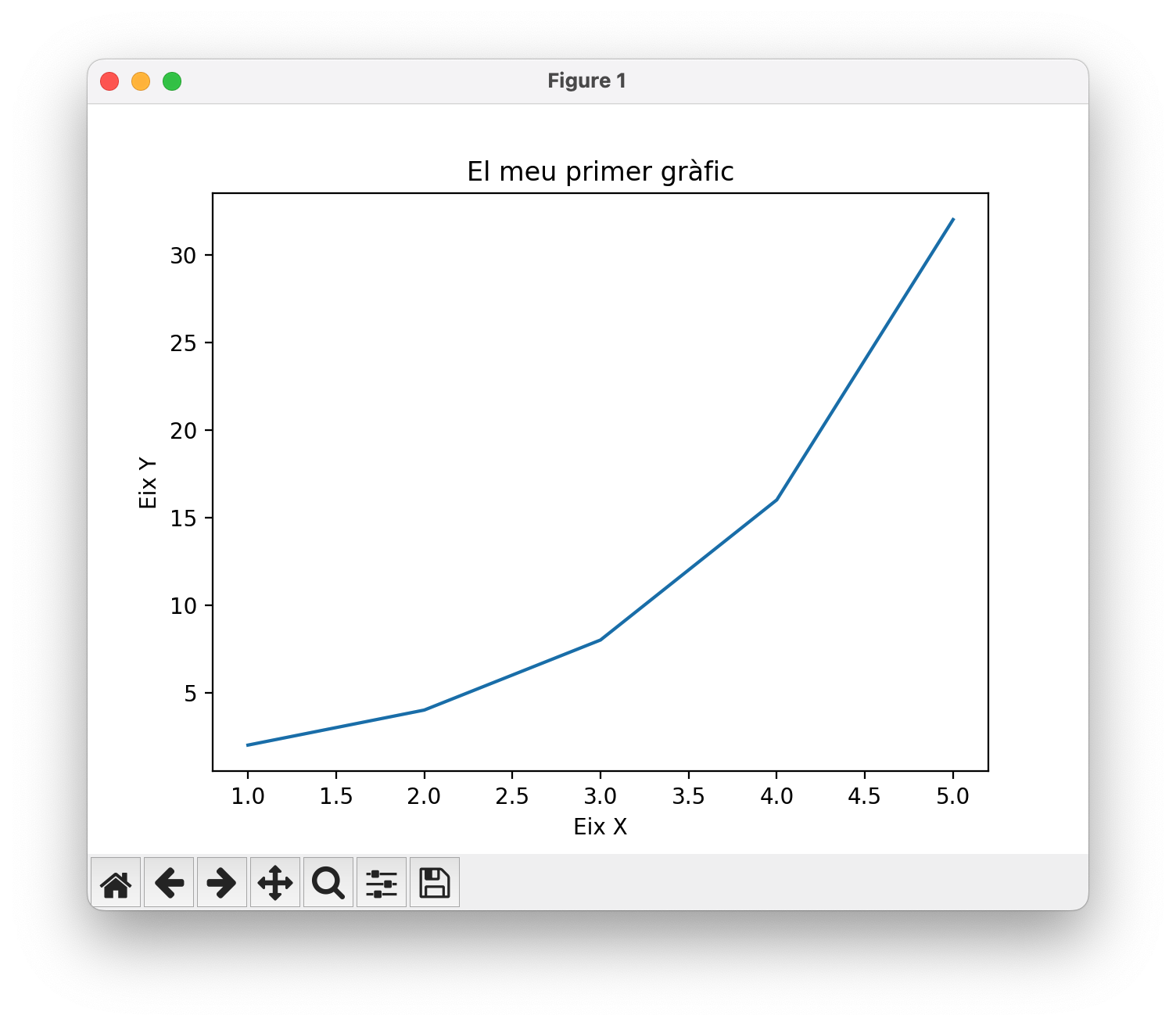
The tools in the bottom bar allow you to save the plot in various formats (PNG, SVG, PDF, etc.), zoom in, and move around the image.
The program works simply:
Imports the
pyplotmodule from Matplotlib using the aliasplt, following the usual convention.Defines the data to plot in two lists:
xandy.Uses the function
plt.plot(x, y)to create the line plot.Adds a title and axis labels with the functions
plt.title(),plt.xlabel(), andplt.ylabel().Finally, displays the plot with
plt.show().
Saving plots
If you want to save the plot without displaying it, you can use plt.savefig("filename.format") instead of (or in addition to) plt.show(). Below is the saved result in SVG format with plt.savefig("p1.svg"):

SVG images are scalable and ideal for inclusion in high-quality publications (like this one! 😂). Other common formats are PNG (bitmap image) and PDF (vector document).
Additionally, the dpi parameter controls the resolution (dots per inch), and bbox_inches='tight' removes unnecessary white space around the plot.
If you want to save the plot with a dark background, you can use the command plt.style.use("dark_background") before creating the plot. Here is the same plot saved with a dark background:

If you want to save the plot without a background color (transparent), you can use the parameter transparent=True in plt.savefig(). This is useful for overlaying the plot on other images or backgrounds.
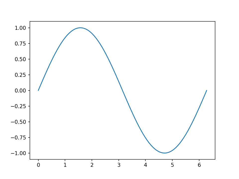
Line plots
Line plots are ideal for showing the evolution of continuous data. With numpy we can generate smoother data and create multiple series in the same plot. The function legend() shows the legend with labels for each line, and grid() adds a grid to facilitate reading:
import matplotlib.pyplot as plt
import numpy as np

x = np.linspace(0, 10, 100) # 100 points between 0 and 10
y = np.sin(x)

plt.plot(x, y, label='sin(x)')
plt.plot(x, np.cos(x), label='cos(x)')
plt.legend()
plt.grid()
plt.show()
Here is the result:

Scatter plots
Scatter plots show the relationship between two variables. We can customize each point with different colors and sizes. The parameter c controls the color of each point, s the size, and alpha the transparency. The color bar (colorbar) shows the color scale used:
x = np.random.rand(50)
y = np.random.rand(50)
colors = np.random.rand(50)
sizes = 1000 * np.random.rand(50)

plt.scatter(x, y, c=colors, s=sizes, alpha=0.5)
plt.colorbar()
plt.show()
The resulting plot is the following:

Note that, for brevity, we will no longer write the imports of matplotlib.pyplot and numpy, but they must be done before running the code.
Histograms
Histograms show the frequency distribution of a dataset. The bins parameter determines the number of bars (intervals) into which the data is divided. The edgecolor option adds an outline to each bar to improve visualization:
data = np.random.randn(1000)

plt.hist(data, bins=30, edgecolor='black')
plt.xlabel('Value')
plt.ylabel('Frequency')
plt.title('Histogram')
plt.show()
The result is this histogram:

Bar charts
Bar charts are perfect for comparing values between categories. Each bar represents a category and its height indicates the corresponding value:
categories = ['A', 'B', 'C', 'D']
values = [23, 45, 56, 78]

plt.bar(categories, values, color='skyblue')
plt.xlabel('Category')
plt.ylabel('Value')
plt.show()
The resulting bar chart is this:

Pie charts
Pie charts show proportions of a whole. The explode parameter allows separating one sector from the rest to highlight it. The autopct option shows the percentages, and startangle allows rotating the chart:
labels = ['Python', 'Java', 'JavaScript', 'C++']
sizes = [35, 25, 20, 20]
colors = ['gold', 'lightblue', 'lightgreen', 'coral']
explode = (0.1, 0, 0, 0)

plt.pie(sizes, explode=explode, labels=labels, colors=colors,
        autopct='%1.1f%%', shadow=True, startangle=90)
plt.axis('equal')
plt.show()
The resulting pie chart is this:

Box plots
Box plots show the statistical distribution of data, including the median, quartiles, and outliers. They are useful for comparing distributions between different groups:
data = [np.random.normal(0, std, 100) for std in range(1, 4)]

plt.boxplot(data, tick_labels=['Group 1', 'Group 2', 'Group 3'])
plt.ylabel('Values')
plt.show()
The example generates this box plot:

Heatmaps
Heatmaps represent matrix data with colors, where each value is translated into a color intensity. The cmap parameter specifies the color scheme (like 'viridis', 'hot', 'cool'), and aspect controls the aspect ratio of the cells:
data = np.random.rand(10, 10)

plt.imshow(data, cmap='viridis', aspect='auto')
plt.colorbar()
plt.title('Heatmap')
plt.show()
The resulting heatmap is this:

Violin plots
Violin plots combine box plots with density estimates, showing the full distribution of the data. The options showmeans and showmedians add marks for the mean and median:
data = [np.random.normal(0, std, 100) for std in range(1, 5)]

plt.violinplot(data, showmeans=True, showmedians=True)
plt.xlabel('Groups')
plt.ylabel('Values')
plt.show()
The resulting violin plot is this:

Multiple subplots
The function subplot(rows, columns, position) allows creating multiple plots in the same figure. tight_layout() automatically adjusts the spacing between subplots to avoid overlaps:
x = np.linspace(0, 10, 100)

plt.figure(figsize=(10, 4))

plt.subplot(1, 2, 1)
plt.plot(x, np.sin(x))
plt.title('sin(x)')

plt.subplot(1, 2, 2)
plt.plot(x, np.cos(x))
plt.title('cos(x)')

plt.tight_layout()
plt.show()
The result is this figure containing the two subplots:

Colors and line styles
Matplotlib allows customizing the appearance of lines with short codes. For example, 'r-' is a solid red line, 'b--' is a blue dashed line, and 'g:' is a green dotted line. The linewidth parameter controls the thickness of the line:
x = np.linspace(0, 10, 100)

plt.plot(x, x, 'r-', label='red line')
plt.plot(x, x**1.5, 'b--', label='blue dashed line')
plt.plot(x, x**2, 'g:', linewidth=3, label='green dotted line')
plt.legend()
plt.show()
Here we can see the different lines with their styles:

Axis limits
With xlim() and ylim() we can control the visible range of the axes to focus on a specific region of the plot:
x = np.linspace(0, 10, 100)
y = np.sin(x)

plt.plot(x, y)
plt.xlim(2, 8)
plt.ylim(-0.5, 0.5)
plt.show()
Predefined styles
Matplotlib includes several predefined styles that change the overall appearance of plots (colors, fonts, grids, etc.). Some popular styles are 'seaborn-v0_8-darkgrid', 'ggplot', 'fivethirtyeight':
plt.style.use('seaborn-v0_8-darkgrid')

x = np.linspace(0, 10, 100)
plt.plot(x, np.sin(x))
plt.show()
The plot with the applied style is this:

3D plots
To create three-dimensional plots we need the module mpl_toolkits.mplot3d. meshgrid() creates a 2D coordinate grid, and plot_surface() draws a 3D surface. The cmap parameter determines the color scheme of the surface:
import matplotlib.pyplot as plt
import numpy as np
from mpl_toolkits.mplot3d import Axes3D

fig = plt.figure()
ax = fig.add_subplot(111, projection='3d')

x = np.linspace(-5, 5, 100)
y = np.linspace(-5, 5, 100)
X, Y = np.meshgrid(x, y)
Z = np.sin(np.sqrt(X**2 + Y**2))

ax.plot_surface(X, Y, Z, cmap='coolwarm')
ax.set_xlabel('X')
ax.set_ylabel('Y')
ax.set_zlabel('Z')
plt.show()
Look how beautiful this 3D surface is:

Annotations and text
Annotations allow adding explanations to plots. annotate() creates an annotation with an arrow pointing to a specific point. The xy parameter indicates the pointed point, xytext the position of the text, and arrowprops defines the style of the arrow. text() simply places text at a position:
x = np.linspace(0, 10, 100)
y = np.sin(x)

plt.plot(x, y)
plt.annotate('Maximum', xy=(np.pi/2, 1), xytext=(2, 1.3),
             arrowprops=dict(arrowstyle='->', color='red'))
plt.text(8, -0.5, 'y = sin(x)', fontsize=12, style='italic')
plt.show()
Easy, right?

Contour plots
Contour plots show level curves of a function of two variables. contour() draws the contour lines, while contourf() fills the space between lines with colors. The levels parameter controls how many contour lines are drawn:
x = np.linspace(-3, 3, 100)
y = np.linspace(-3, 3, 100)
X, Y = np.meshgrid(x, y)
Z = np.sin(X) * np.cos(Y)

plt.contour(X, Y, Z, levels=10, cmap='RdBu')
plt.colorbar()
plt.contourf(X, Y, Z, levels=10, cmap='RdBu', alpha=0.3)
plt.show()
The resulting contour plot is this:

Logarithmic scales
Logarithmic scales are useful when data covers several orders of magnitude. loglog() applies logarithmic scale to both axes. There are also semilogx() and semilogy() to apply logarithmic scale to only one axis:
x = np.linspace(0.1, 100, 1000)
y = x**2

plt.loglog(x, y)
plt.xlabel('x (log scale)')
plt.ylabel('y (log scale)')
plt.grid(True, which='both')
plt.show()
Animations
Matplotlib allows creating animations by updating plots over time. FuncAnimation() repeatedly calls a function that updates the data. The frames parameter indicates the number of iterations, interval the time between frames in milliseconds, and blit=True optimizes performance:
import matplotlib.pyplot as plt
import matplotlib.animation as animation
import numpy as np

fig, ax = plt.subplots()
x = np.linspace(0, 2*np.pi, 100)
line, = ax.plot(x, np.sin(x))

def animate(i):
    line.set_ydata(np.sin(x + i/10))
    return line,

ani = animation.FuncAnimation(fig, animate, frames=100, interval=50, blit=True)
plt.show()
To save the animation as a video file, you can use the save() method of the FuncAnimation object, specifying the filename and desired format (such as MP4 or GIF):
ani.save('animation.gif', writer='ffmpeg', dpi=150)Here is the animation showing a moving sine wave:
Interactive plots with events
We can make plots respond to user actions by connecting functions to events. mpl_connect() links events (like mouse clicks) to custom functions. The event object contains information about the event, including the click coordinates:
fig, ax = plt.subplots()
x = np.linspace(0, 10, 100)
line, = ax.plot(x, np.sin(x))

def onclick(event):
    if event.xdata and event.ydata:
        print(f'You clicked at ({event.xdata:.2f}, {event.ydata:.2f})')

fig.canvas.mpl_connect('button_press_event', onclick)
plt.show()
Complete example
This example integrates many techniques: multiple lines with different styles, shaded area between lines with fill_between(), reference lines with axhline() and axvline(), font customization, and a semi-transparent grid:
x = np.linspace(0, 2*np.pi, 100)
y1 = np.sin(x)
y2 = np.cos(x)

plt.figure(figsize=(10, 6))
plt.plot(x, y1, 'b-', linewidth=2, label='sin(x)')
plt.plot(x, y2, 'r--', linewidth=2, label='cos(x)')
plt.fill_between(x, y1, y2, alpha=0.3)

plt.xlabel('x (radians)', fontsize=12)
plt.ylabel('y', fontsize=12)
plt.title('Trigonometric functions', fontsize=14, fontweight='bold')
plt.legend(loc='upper right')
plt.grid(True, alpha=0.3)
plt.axhline(y=0, color='k', linewidth=0.5)
plt.axvline(x=0, color='k', linewidth=0.5)

plt.tight_layout()
plt.show()
The resulting plot is this:
